Presentation Boards
Vivid Images that Communicate
/prod01/twu-cdn-pxl/media/images/fashion-textiles/PBHeader.jpg)

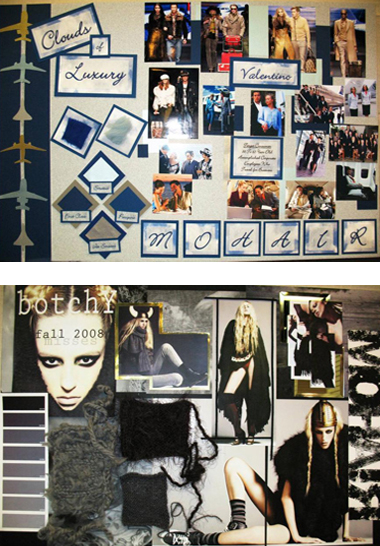
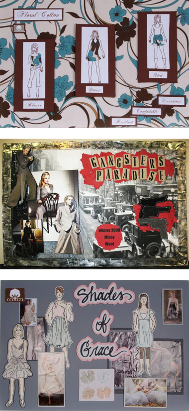
- A presentation board should combine an evocative theme, a visual development of the theme, and a verbal flourish in order to engage the viewer's imagination and awareness.
- Presentation boards most often focus on a fashion trend or theme that is likely to move into the mainstream.
- Style, look, fabric, color, detail
- This trend or theme has already been tested in the market and is predicted to sell well to consumers.
- A board often is labeled in a way that describes the appeal of the trend or theme.
- Retro, Minimalist, Youthful, Working Women, Career Casual
- Lifestyle, pop culture influence, historical, ethnic, mood, spirit
- Design teams can translate trend boards into concept boards that are used to guide designers in line development.
- Having a visual concept of an idea assists the design team in keeping focused on a desired direction.
- Concept boards also are used to sell products to a manufacturer’s sales force and to retail buyers.
- Finally, concept boards are used to educate a retail sales force.

Theme
Developing a theme or concept can be difficult.
A theme should capture the essence of a trend, but can be a creative challenge.
Once identified, the theme becomes the unifying force for everything on the board.
- Typeface for lettering
- Fabric swatches
Graphics
Graphic balance is essential; shapes and elements must be in proportion to the board.
Images, Photos and Sketches
Images should interpret the mood of the theme.

Color Palette
Color interplay must make sense and augment the theme.
Give consideration to hue, value, and intensity.
Layout
The layout of the board determines how the viewer sees and comprehends the content and idea of the theme.
- The eye should continue to move within the borders of the board.
- The best boards have a focal point with all of the items contained on the board arranged to move the eye on a path around the board.
The first step is to decide on orientation, either portrait or landscape.
/prod01/twu-cdn-pxl/media/images/fashion-textiles/PBLandscapePort.jpg)
/prod01/twu-cdn-pxl/media/images/fashion-textiles/PBThirds.jpg)
/prod01/twu-cdn-pxl/media/images/fashion-textiles/PBLayouts.jpg)
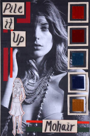
Examples of strong presentation boards:
Page last updated 2:14 PM, May 24, 2017
/prod01/twu-cdn-pxl/media/images/fashion-textiles/PBSlide1.jpg)
/prod01/twu-cdn-pxl/media/images/fashion-textiles/PBSlide2.jpg)
/prod01/twu-cdn-pxl/media/images/fashion-textiles/PBSlide3.jpg)
/prod01/twu-cdn-pxl/media/images/fashion-textiles/PBSlide4.jpg)